




Lemon Leaf approached to refresh their menu system and re-imagine their logo mark in a minimalistic style keeping to their existing themes being used across print and social touchpoints.
The client wanted to update the colours and make the brand more authentic to its roots in India, to bring the cuisine and culture with it. This had to be instantly recogniseable to the customers and leave an impression and set expectations. Below are the existing menu and logo mark.
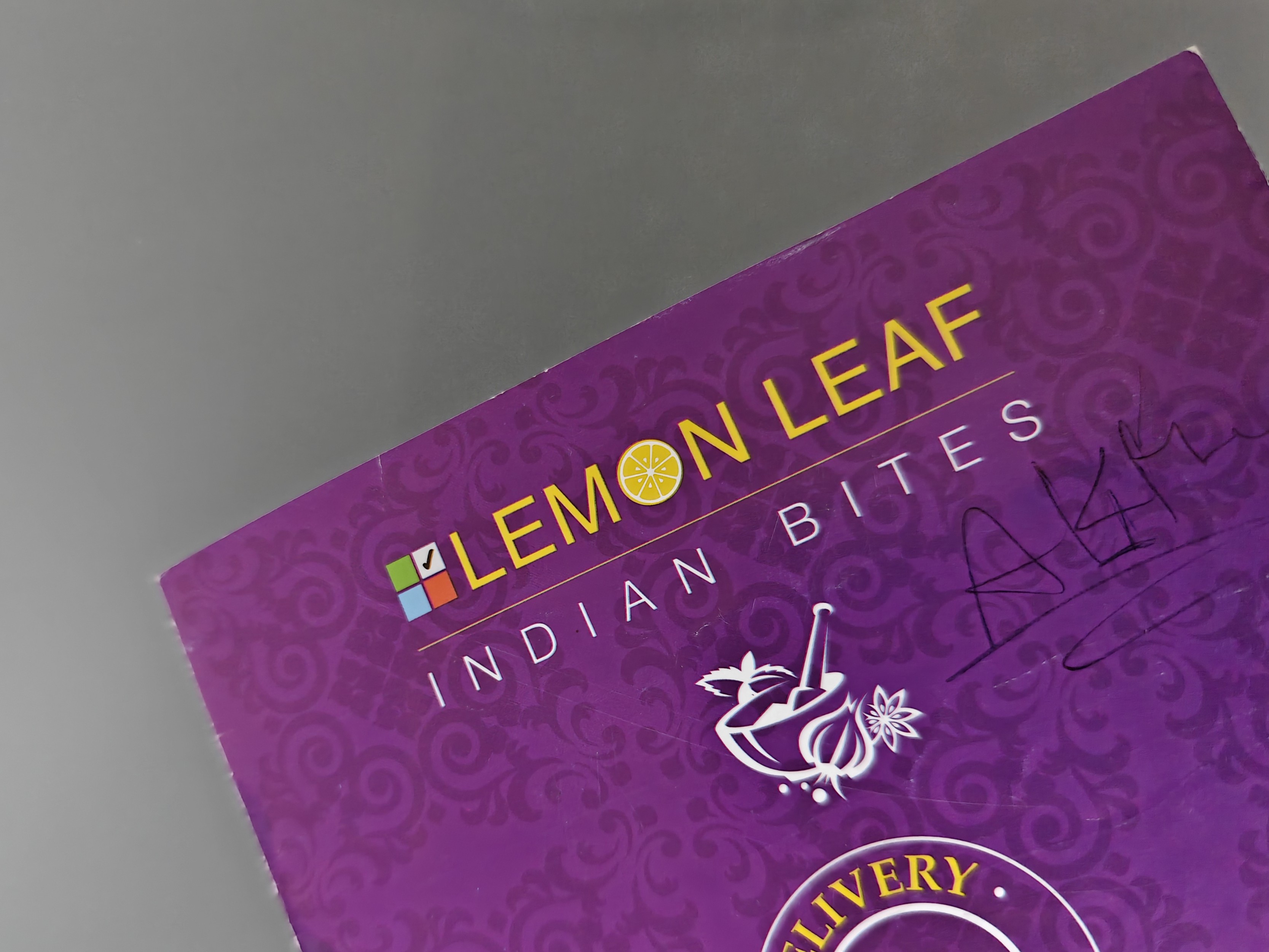
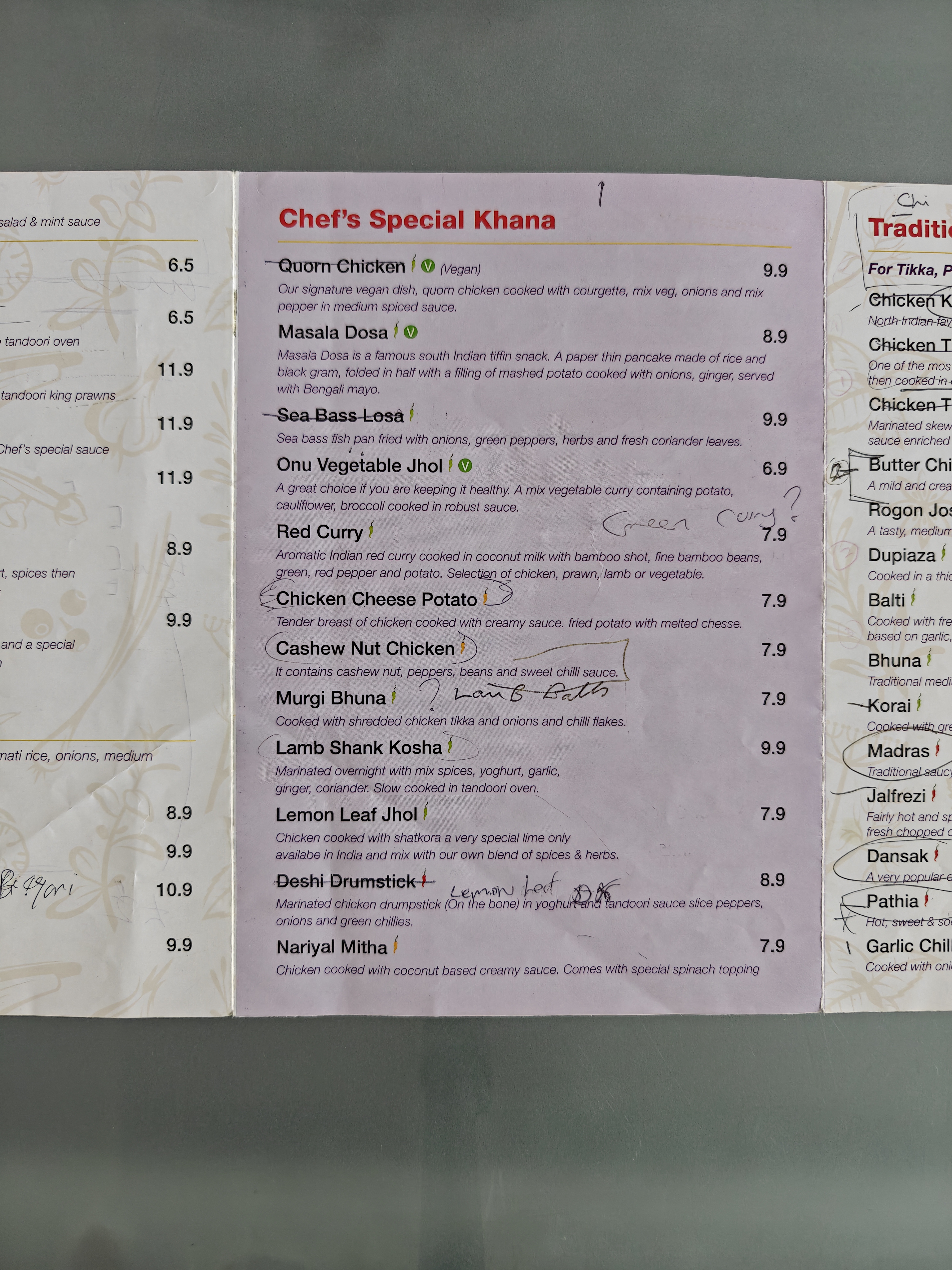
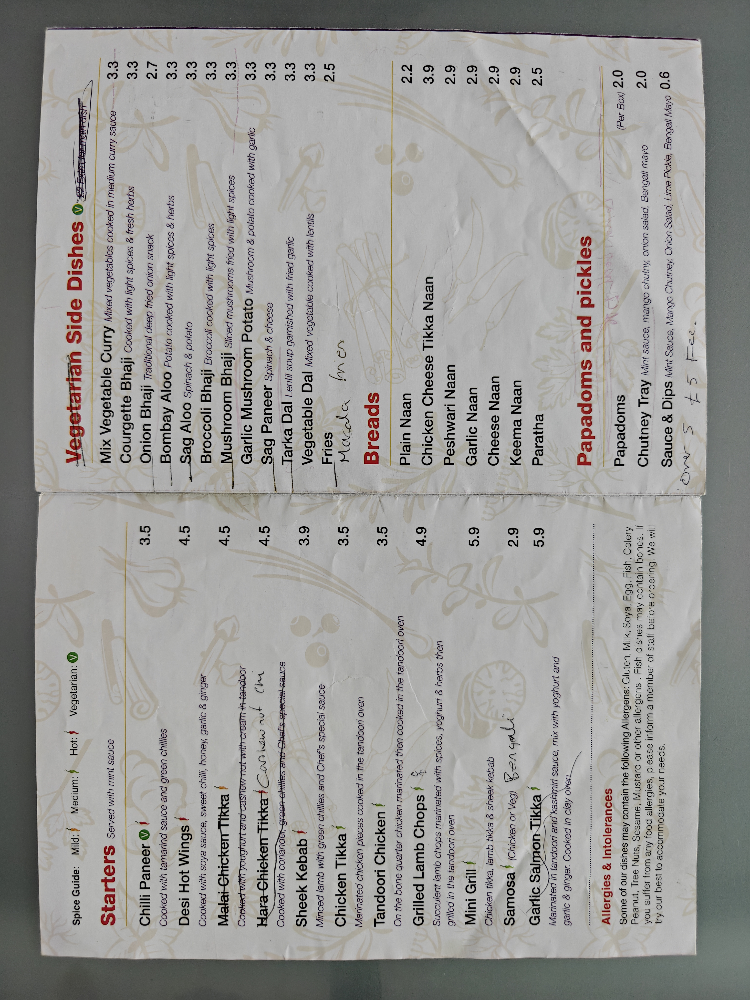
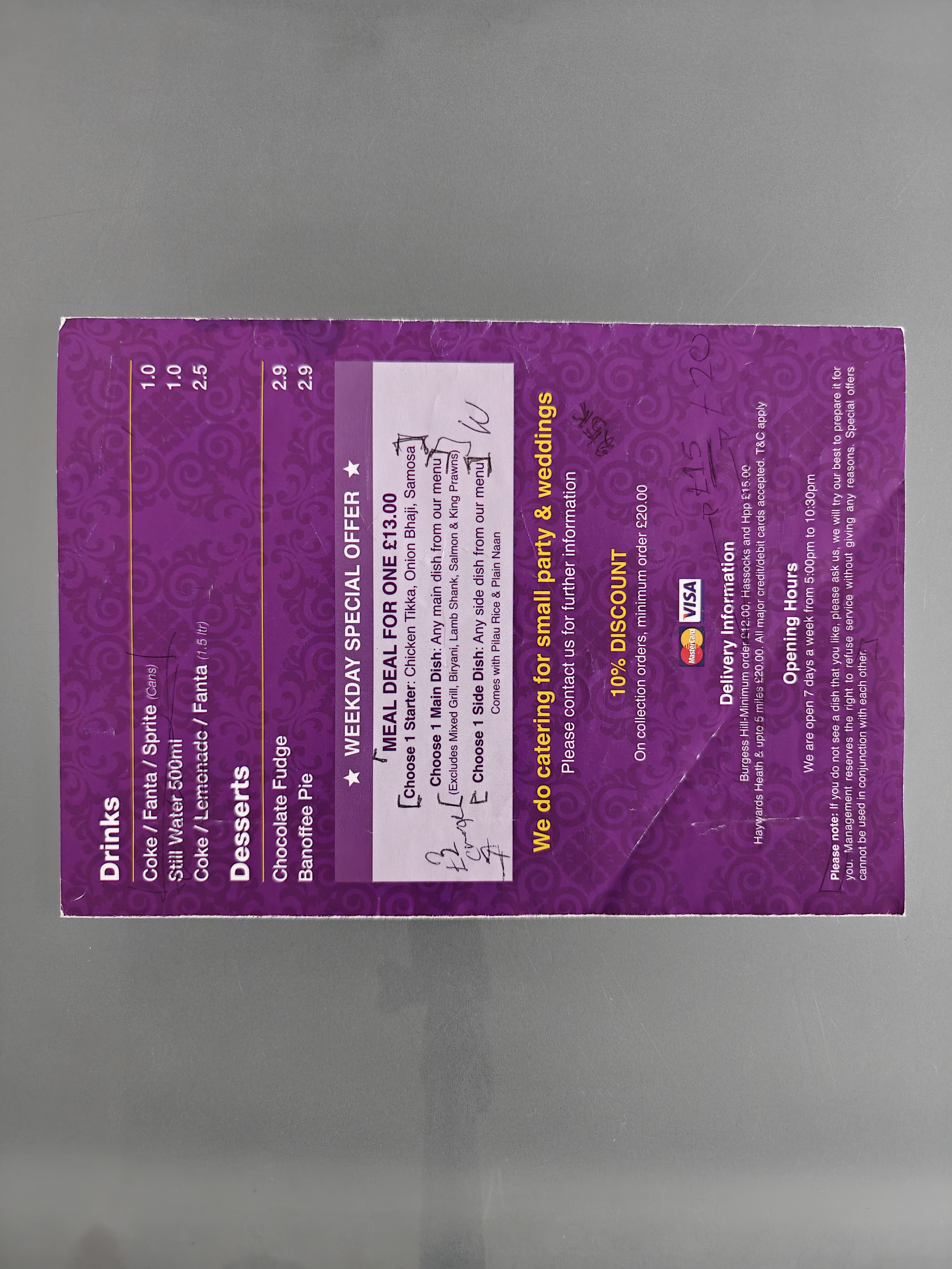
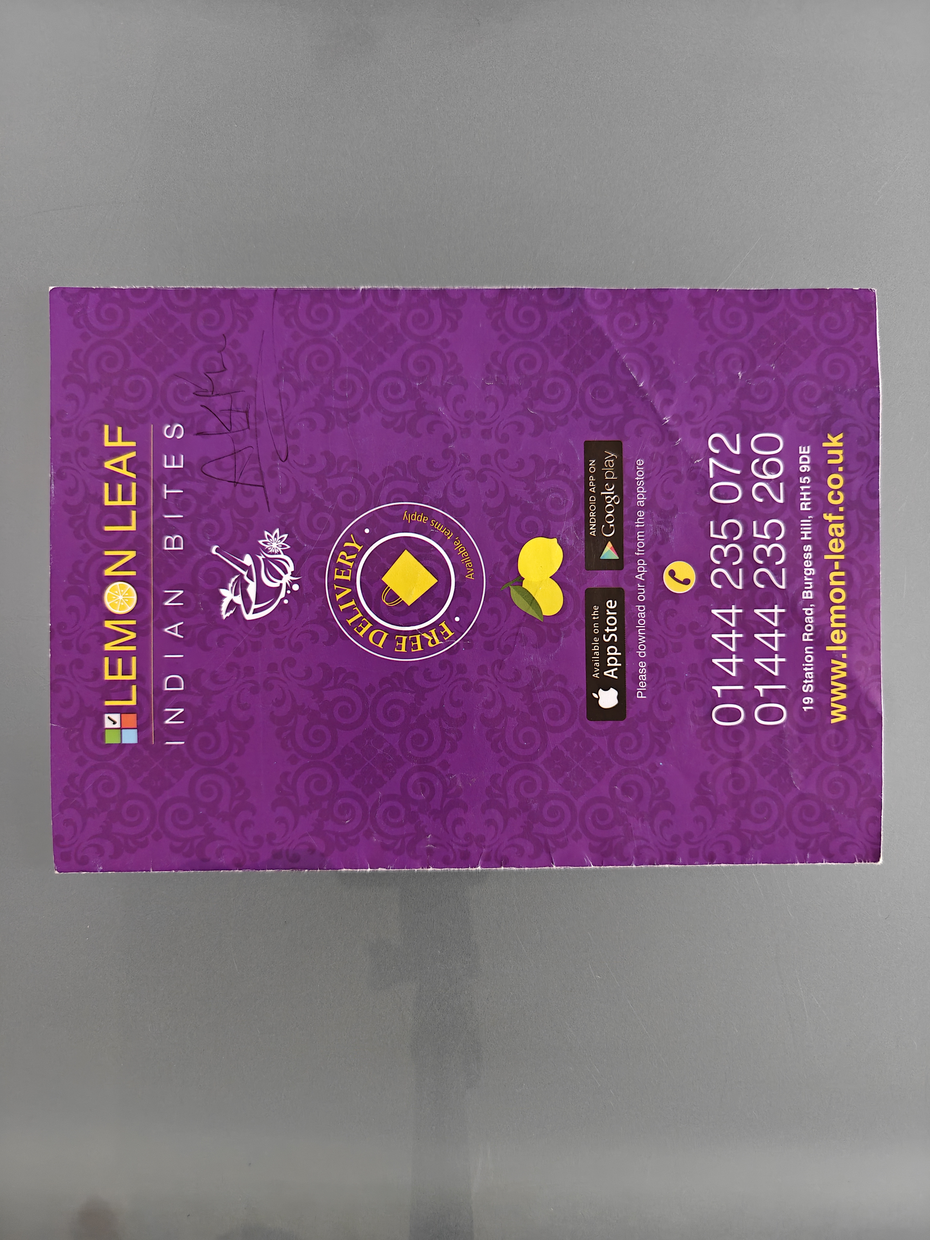
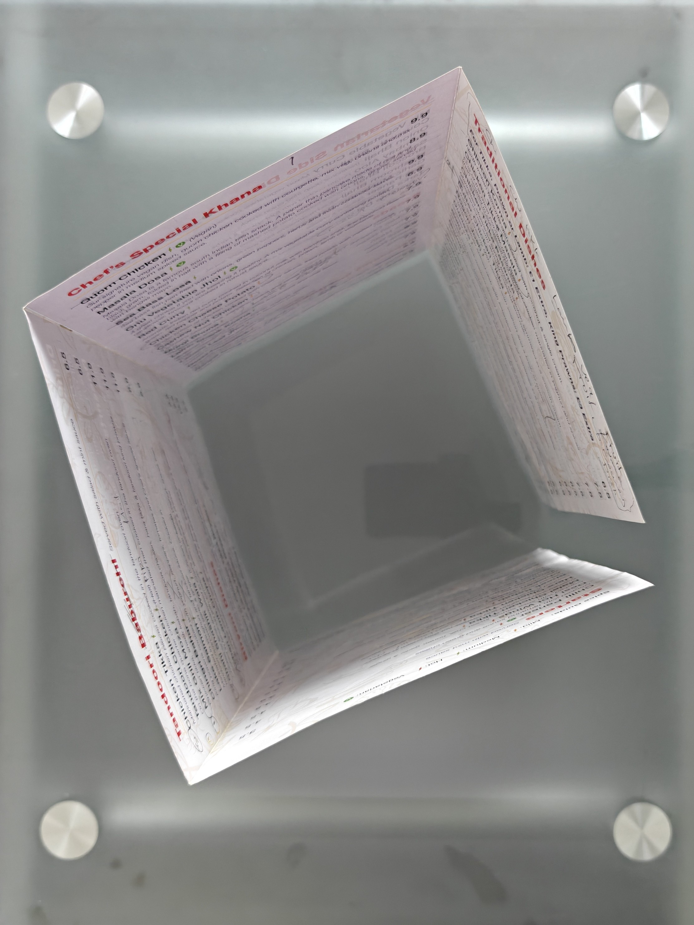

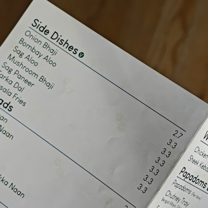
As the menu items were being reduced. The client wanted quality over quantity and I advised to use a b5 tri-fold design to give dish names breathing room and white-space. This would come across as more thought out and intentional from the takeaway whilst also allowing for quick scanability from customers; replacing their crowded quad-fold menu.
The menu items were being refined and multiple options removed to offer the best dishes first without confusing the customer and adding extra dishes for them to decide from. The paradox of choice is a problem that pops up a lot during these types of condensed information redesigns, which hurts sales for businesses. Sometimes, Less is often more within the right spaces.
I collaborated with the client to propose a modern and minimalistic logo that would tie their brand identity together whilst also being recognisable to their existing audience. Working to a schedule to have their new menus printed as the business was being launched.
Delivering a tri-fold menu, a memorable logo and word mark that can be used on both print and digital as well as their mobile app. A rich and vibrant feeling of authentic indian cuisine. representing a central point of dining and unity.
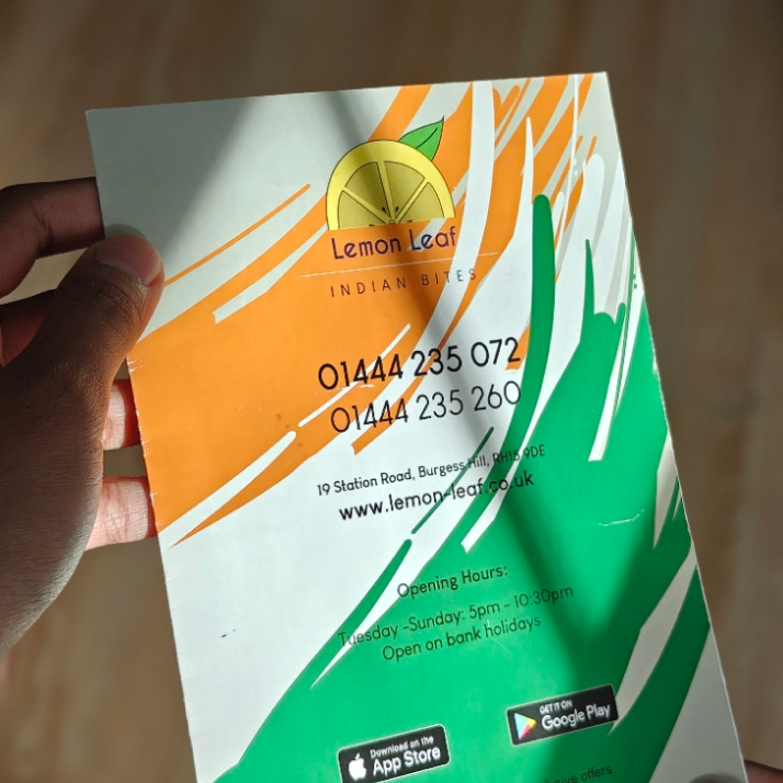
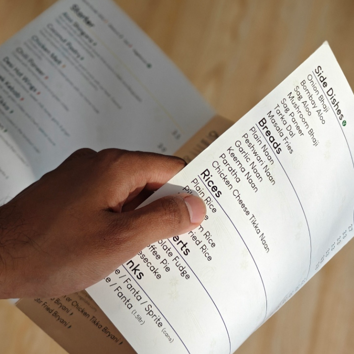
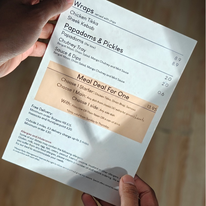
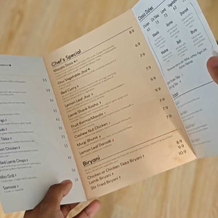
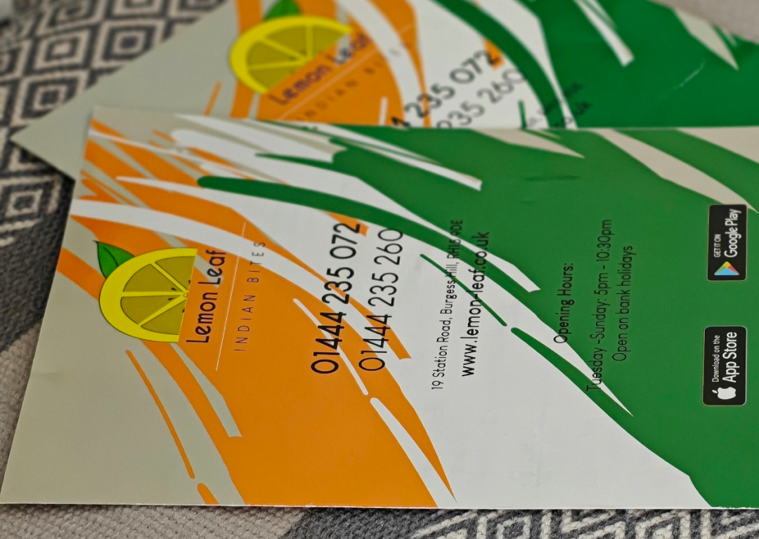
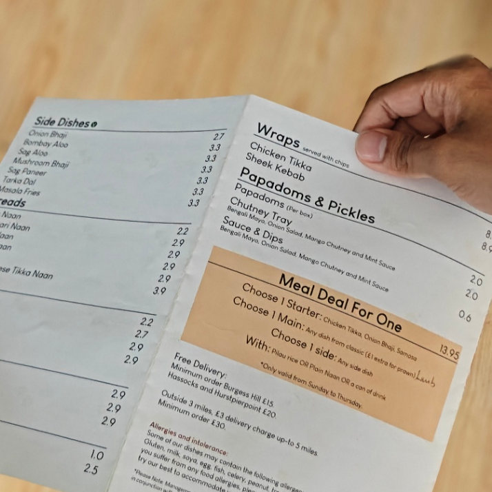
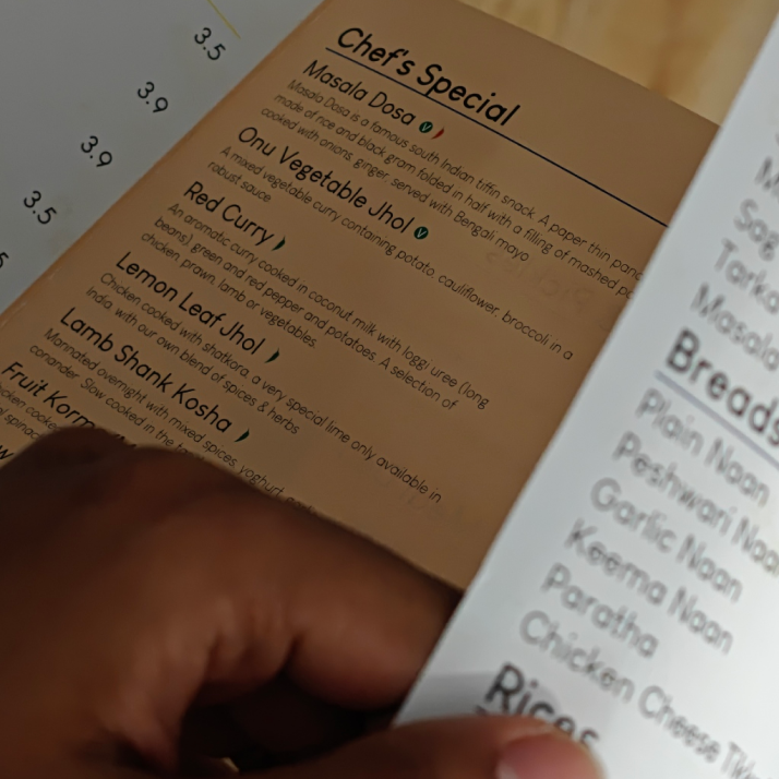
After completion, Lemon leaf used the branding across their touchpoints and for print purposes, along with flyers promoting the app and on the app itself. Integrating the branding as part of their main system with their own team.
Lemon Leaf were happy with the refresh of their menu system, re-imagining their logo mark in a minimalistic style keeping to their existing themes being used across print and digital touchpoints - keeping an authentic feeling to their takeaway business.